2007年标志设计趋势密码
写在前面:我在写 Web2.0的视觉风格进化论 的后续文章的过程中,发现了这篇文章。为了使大家快速的接轨全球设计风尚,我决定翻译这篇文章,我介绍相关的内容越多,我就可以在进化论里面少写一些废话。
这篇文章应该比我翻译的那篇“Web2.视觉设计”译文要好,因为改变了中英完全对译的局限,显得更流畅一些。
2007年标志设计趋势密码
2007 Logo Design Trends
2007年1月发表,1月24日由Quester中文翻译,原文链接:http://logoorange.com/logo-design.php
11 trends that will define Logo design in 2007
Everyone wants to set the curve when it comes to style. No one wants to design out of a book of trends, but nevertheless, they emerge.
Take a peek at the following 11 Logo design trends that we think will define the look of 2007.
11种趋势将定义2007年的Logo设计
每个设计师都想在某一风格成为流行前把握它。没有人愿意自己的设计和流行趋势脱节。但是无论如何,这些趋势总是会露出端倪。
让我们一同来窥探一下这11种我们认为的2007年标志设计的趋势密码。
1. Talk Boxes
This is an outgrowth of last year's trend, even though these boxes have been around a few years now.
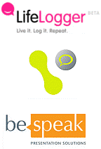
We don't quite know who's doing the talking, but whoever it is, their bubble is popping up all over. This Logo symbolizes communication, whether it be from the company or between its customers. LifeLogger, for instance, uses a speech bubble with a smile in it to illustrate how users can communicate through them to friends. They continue the use of three-dimensional speech bubbles in creating avatars for their users, as illustrated to the right.
In this way, the idea of communication represents the person themselves, showing the importance of contact.
1. 对话泡泡
这是一种去年的流行风格的衍生,尽管这些泡泡已经玩了好几年了。
我们搞不懂是谁在说话,但管它是谁呢,反正满处都是冒的这些泡泡。这个符号象征着沟通,无论是来自企业还是他们的客户之间。LifeLogger(生活的记录者)网站,是一个例证,用泡泡和微笑符号来说话,表明用户可以用什么样的方式和他们的朋友来交流。 他们继续使用立体的对话泡泡来为用户创造神话,就像右边那个泡泡。
在这里,沟通的想法代表这些人本身,想要展示接触的重要性。
2. Clouds
Everyone remembers a time when they laid on their back in the grass, staring at the clouds daydreaming or finding images in their puffs.
Clouds are a powerful Logo, conjuring imagery of dreams, creativity and playfulness. Sometimes clouds are combined with thought bubbles to invoke feelings of dreaminess. The clouds can be a 3D bubble or take on a flat feeling. Many of these cloud Logos represent new ideas, hence the thought bubble. Many "clouds" came from new businesses on the internet, certainly a place for dreamers. Some, also include imagery of the sun, which evokes a feeling of a new dawn.
2. 云状物
每个人都有那些仰面躺在草地上的时候,望着云朵发白日梦或者从腾云变换中寻找图案的记忆。
云状物是一个极有表现力的标志,凭空幻化意象,即有创造性,又很好玩。有时候云状物和“思维泡泡”结合起来,会产生一种梦幻的感觉。云状物可以是三维的泡泡或者只是平面的。许多的云状物Logo用“思维泡泡”来代表一种新思想。
许多的“云朵”来自互联网上的新生意,互联网确实是个梦想之地。有一些,也包含太阳的图形,用来形成“新的曙光”的感觉。
3. Reflections
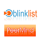
Mirror, mirror, on the wall, what's the hottest trend of all? It might just be reflections. With Apple leading the way, looking like all their graphics were set on a shiny table, others are sure to follow. Dubbed by some as ?the new drop shadow,? reflections are taking over, especially on the web. The reflections might be skewed, such as in the Logo for blinklist, indicating the location of some light source, invisible to the onlooker, but effective in creating even more of a sense of a whole different world the Logo is in.
3. 反射效果(镜像效果)
魔镜魔镜告诉我,什么是最热的潮流啊? 它可能就是“反射效果”。苹果最先开始倡导的,把什么东西都弄得好像放在光滑闪亮的桌面上,其他人就开始跟风。有人给它起了个绰号叫什么来着?“新的下拉阴影”(意思和以前的“下拉阴影”效果一样满天飞)。 “反射效果”全面霸占,尤其是在网上。反射效果可以是不对称的,就像 blinklist 的Logo一样,弄出一些光的效果却让你找不到光源,但对于创造拥有更多“完全不同的世界”感觉的Logo是有效而时尚的。
4. Rectangle
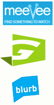
In a graphic world where you can do nearly anything, some companies are keeping it simple with shaded rectangles. Their Logo, in a contrasting white, pops out from the background. Shadow boxes have historically been a sign of amateurish design, but this new generation of effective Logos has shown that good design will always be in style. With the popularity of rounded corners, these Logos stand out with (oh no!) sharp edges and right angles. In some occasions, such as with the blurb Logo, the rectangle can represent an image. Blurb used their blue shadow behind their name to symbolize a book, as they are in the book publishing business.
4. 长方形
在图形世界里,你几乎可以做任何事情,但有些公司只使用简单的带边框的长方形。他们的Logo,从高反差的白色背景上“跳”出来。相框一样的长方形容易给人“业余设计水平”的感觉,但是新生的有活力的这些Logo,表明了好的设计永远都是有品味的。与人气极旺的圆角风格同时,这些Logo因有着锐利的边缘和适当的倾斜角度而特别显眼(不是吧!)。在某些场合,就像 Blurb的Logo,长方形可以用于扮演一个形象。Blurb 用蓝色的图形放在名字后面来代表一本书,因为他们做的是图书出版业务。